ILLUSTRATION | PRINT LAYOUT | BRANDING
TED TURNER RESERVES
Rebrand and Promo Materials
CLIENT
Ted Turner Reserves, via SSM&L
INDUSTRY
Hospitality, Eco-Tourism
YEAR COMPLETED
2019
MY ROLE
Illustration and book design
Brochure layout
Branded stationery collateral
BACKGROUND
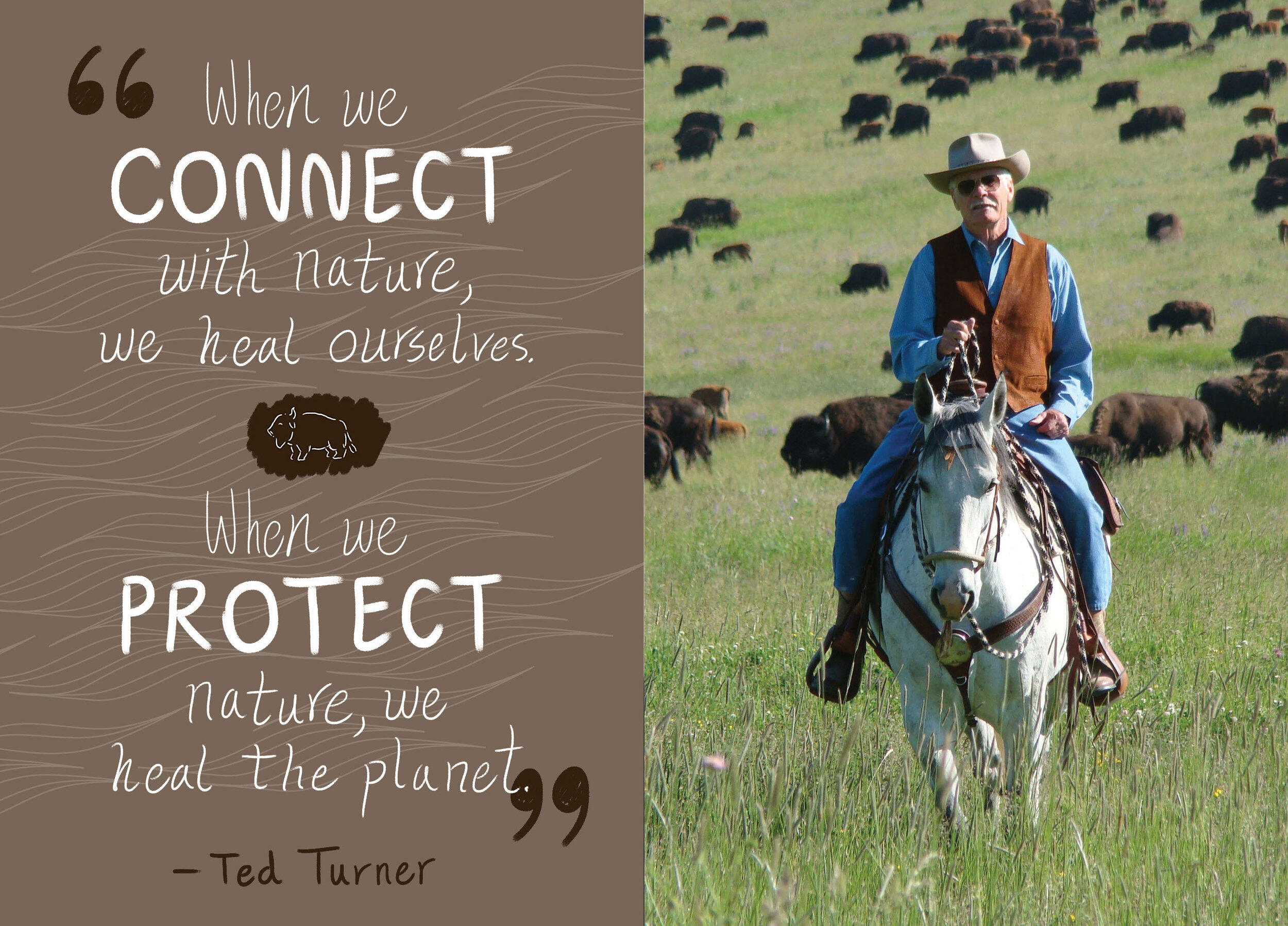
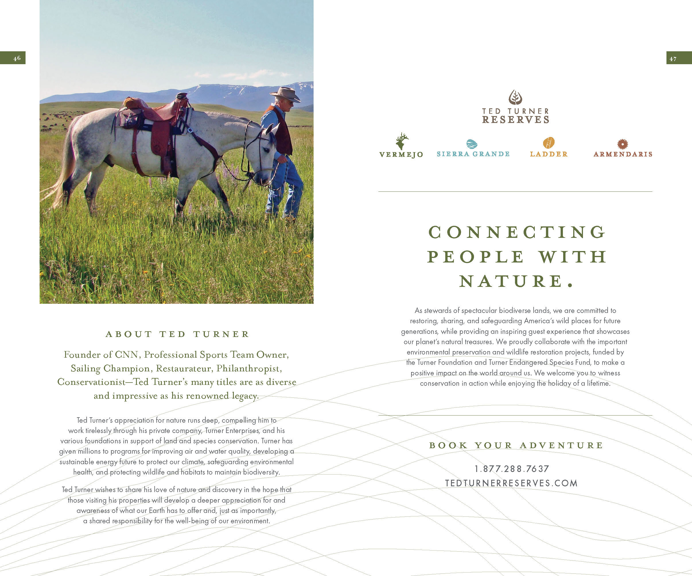
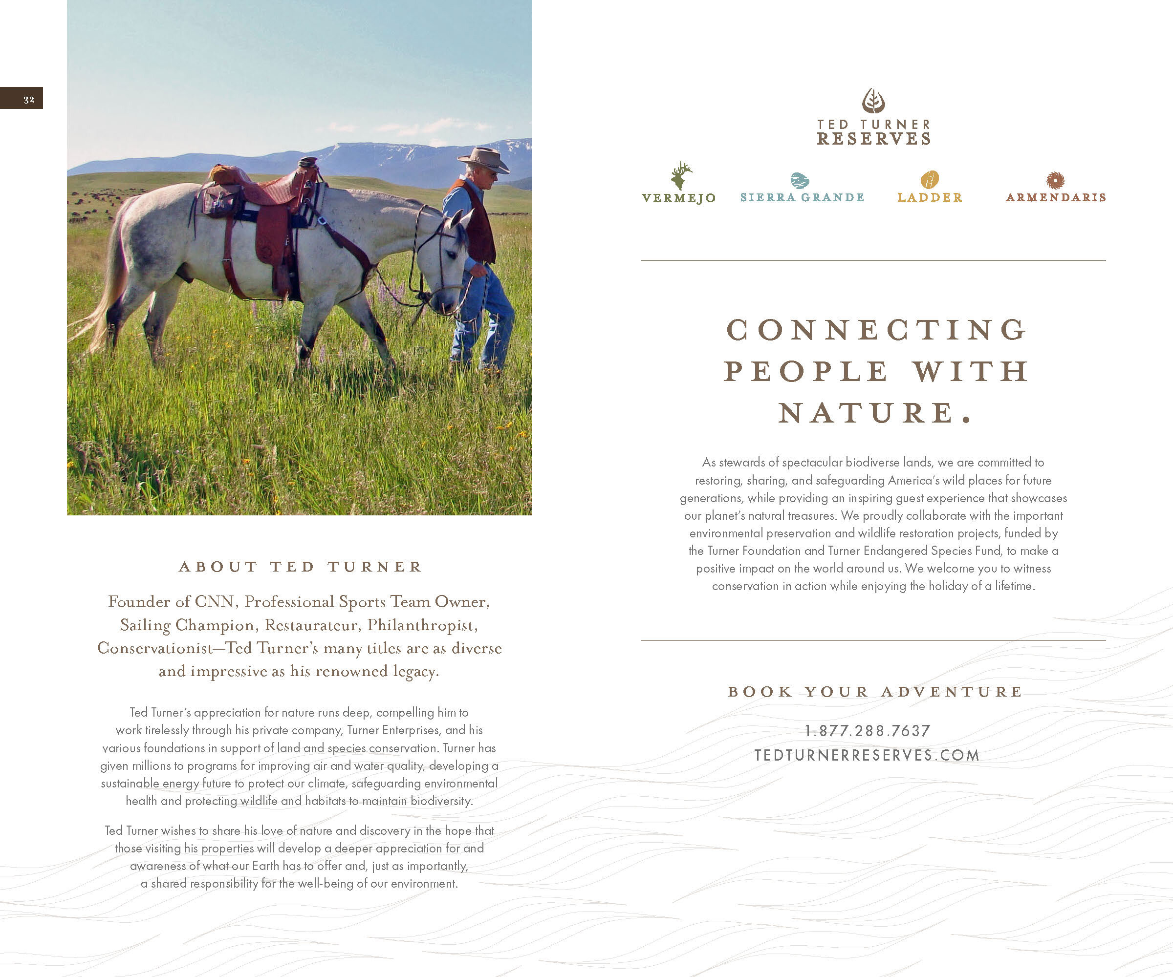
Ted Turner Reserves is a bastion of luxury eco-tourism in the American Southwest, boasting over one million acres of New Mexico landscape across multiple properties and biomes. As a creative agency, we completely overhauled and relaunched the brand, with a new suite of logos and style guides, a revamped website, and a wide swath of print collateral.
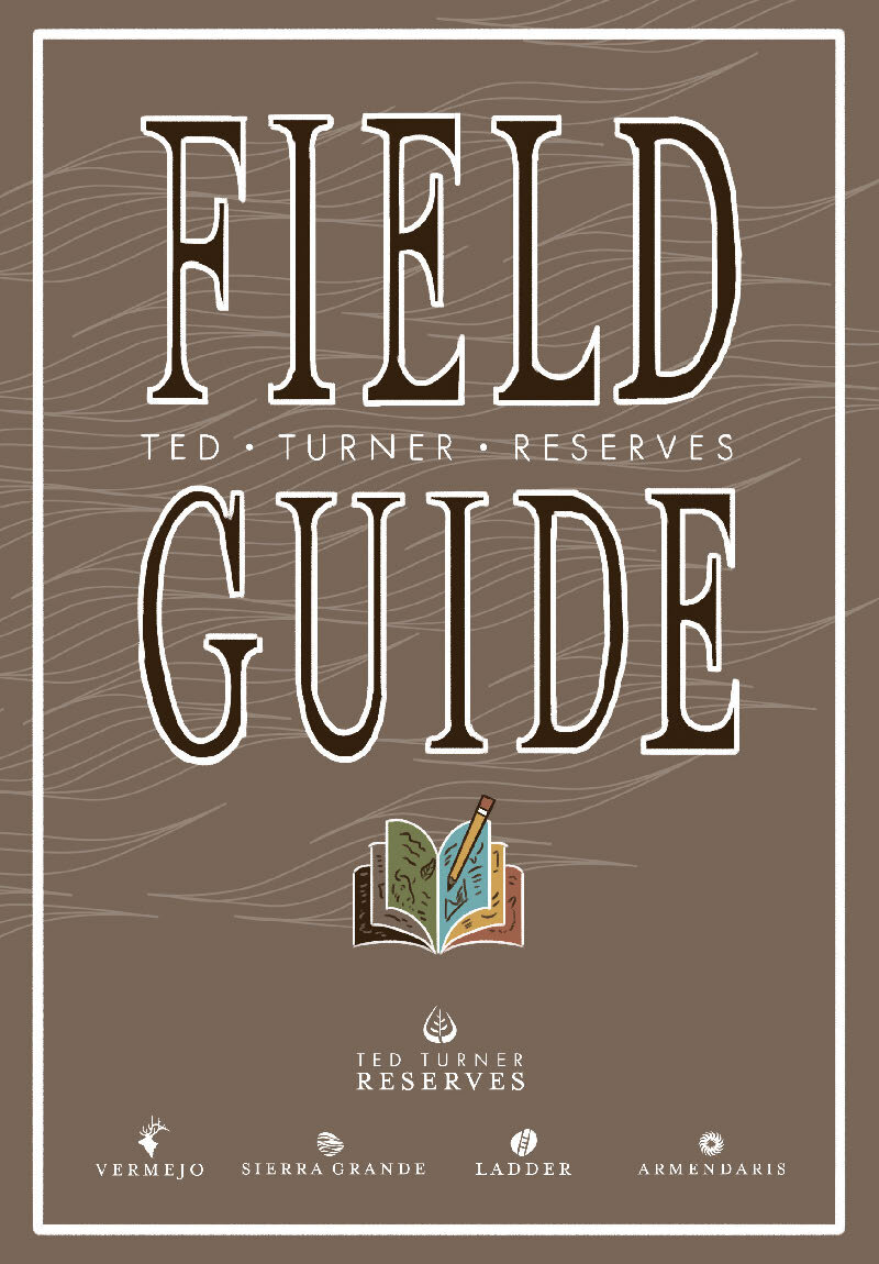
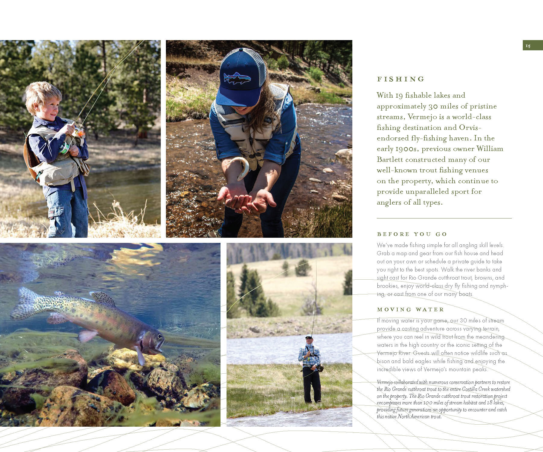
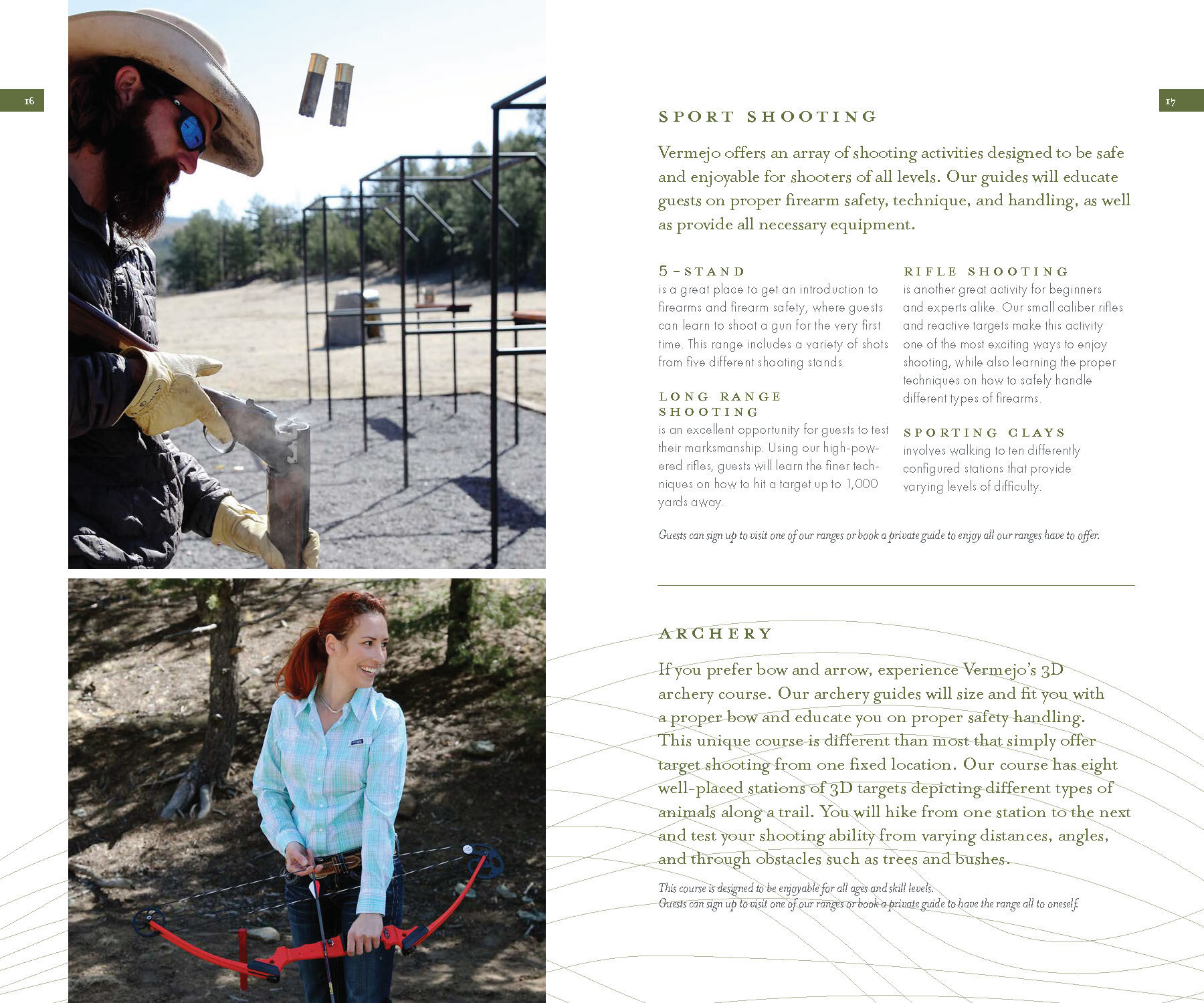
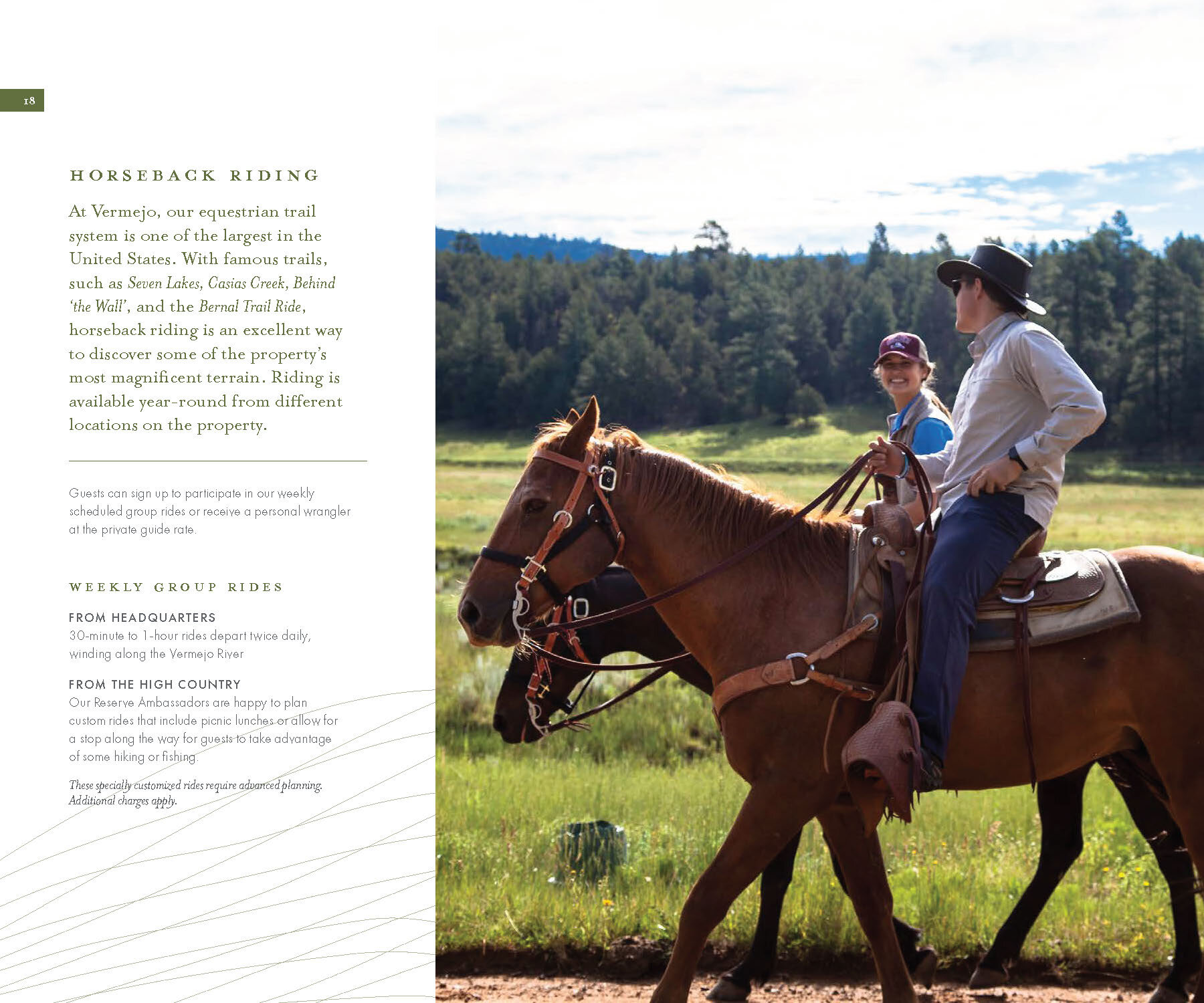
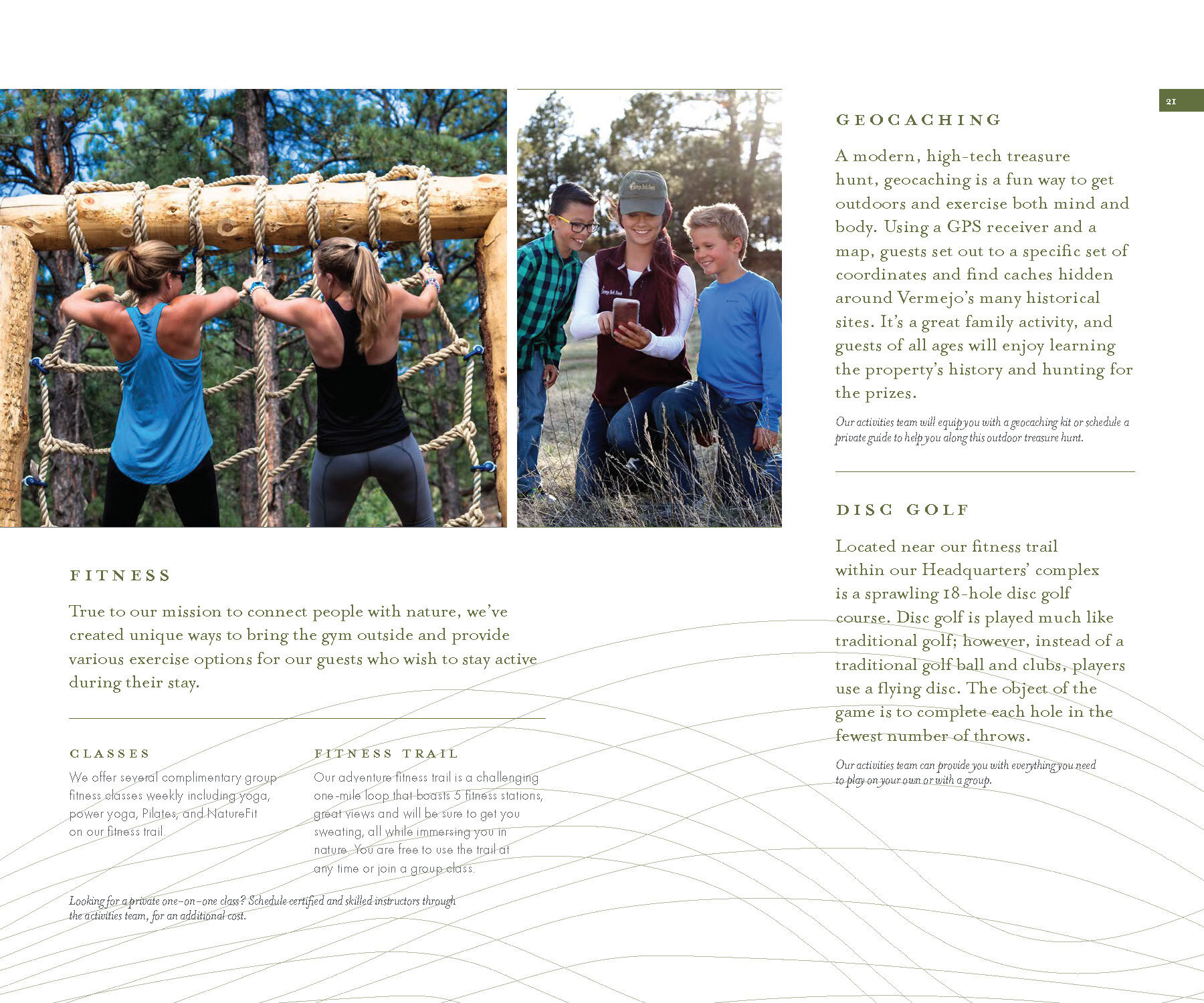
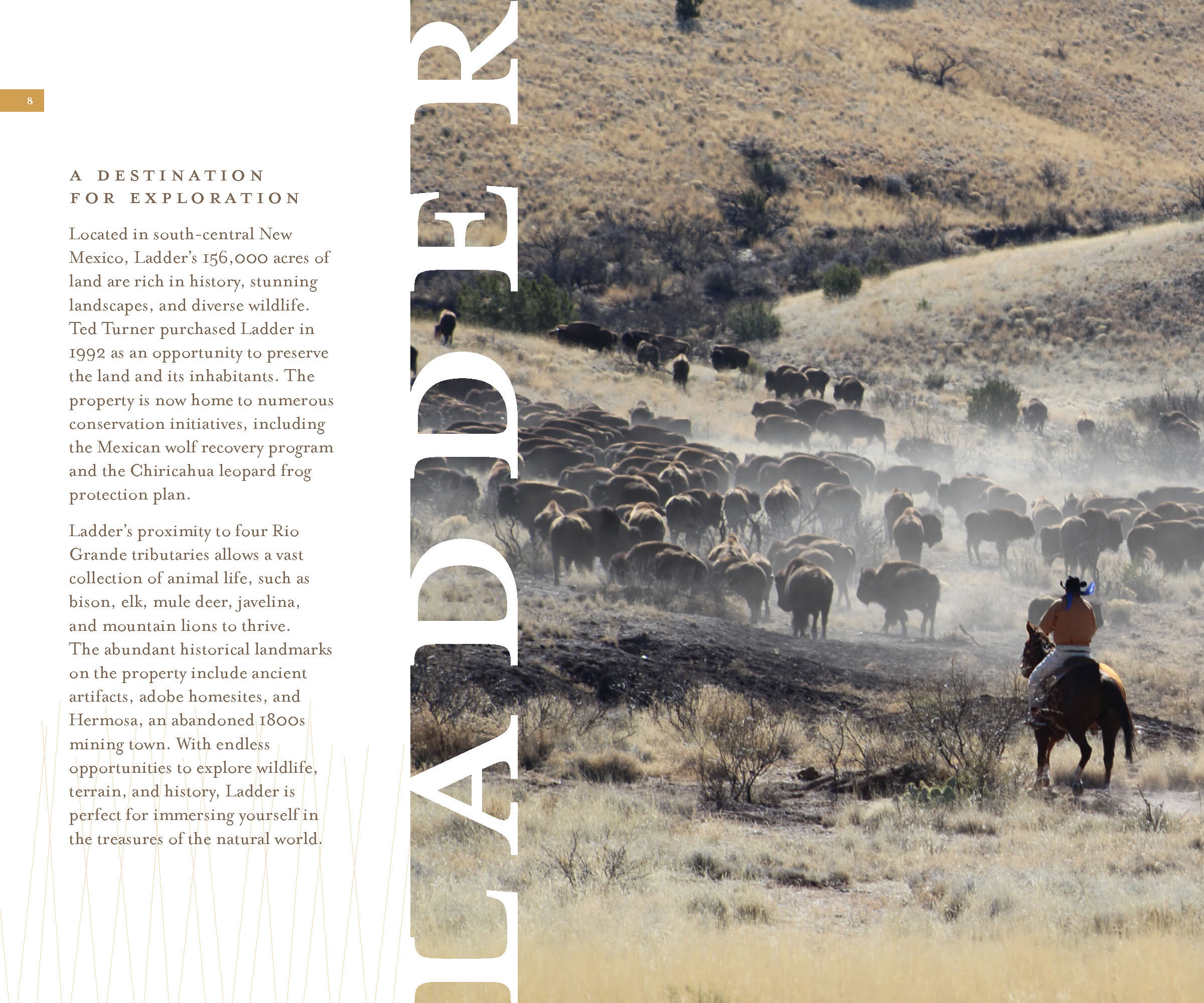
FIELD GUIDE
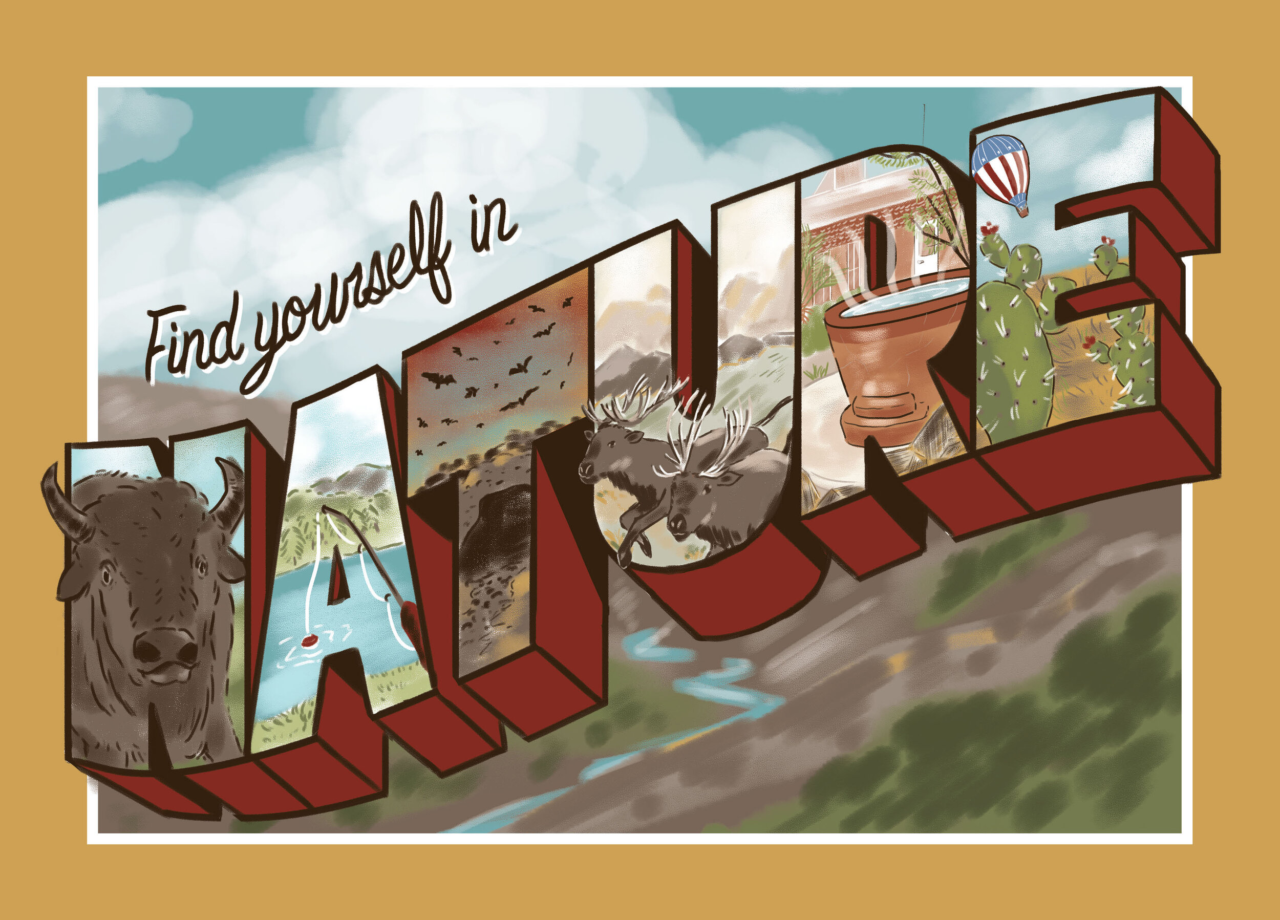
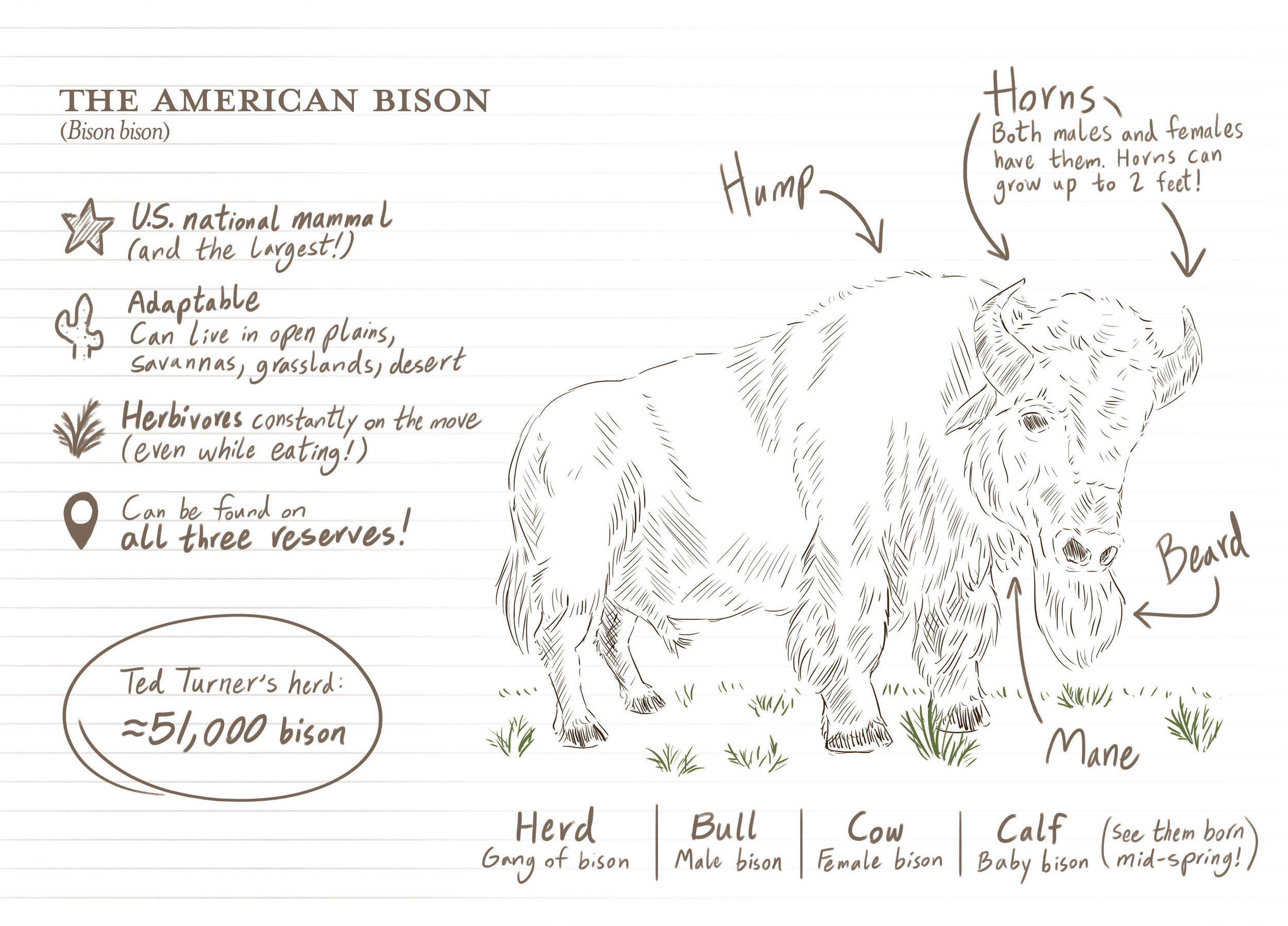
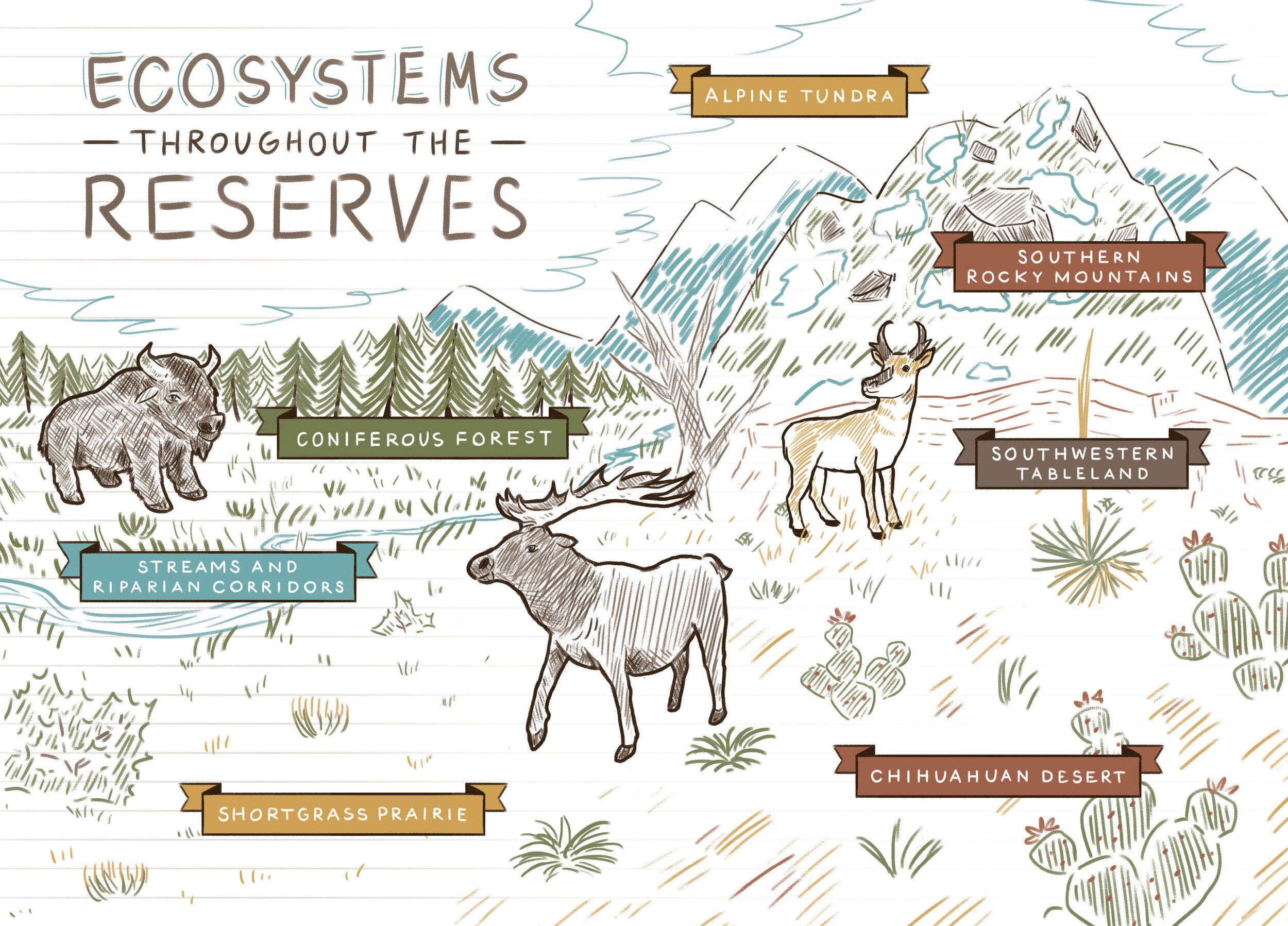
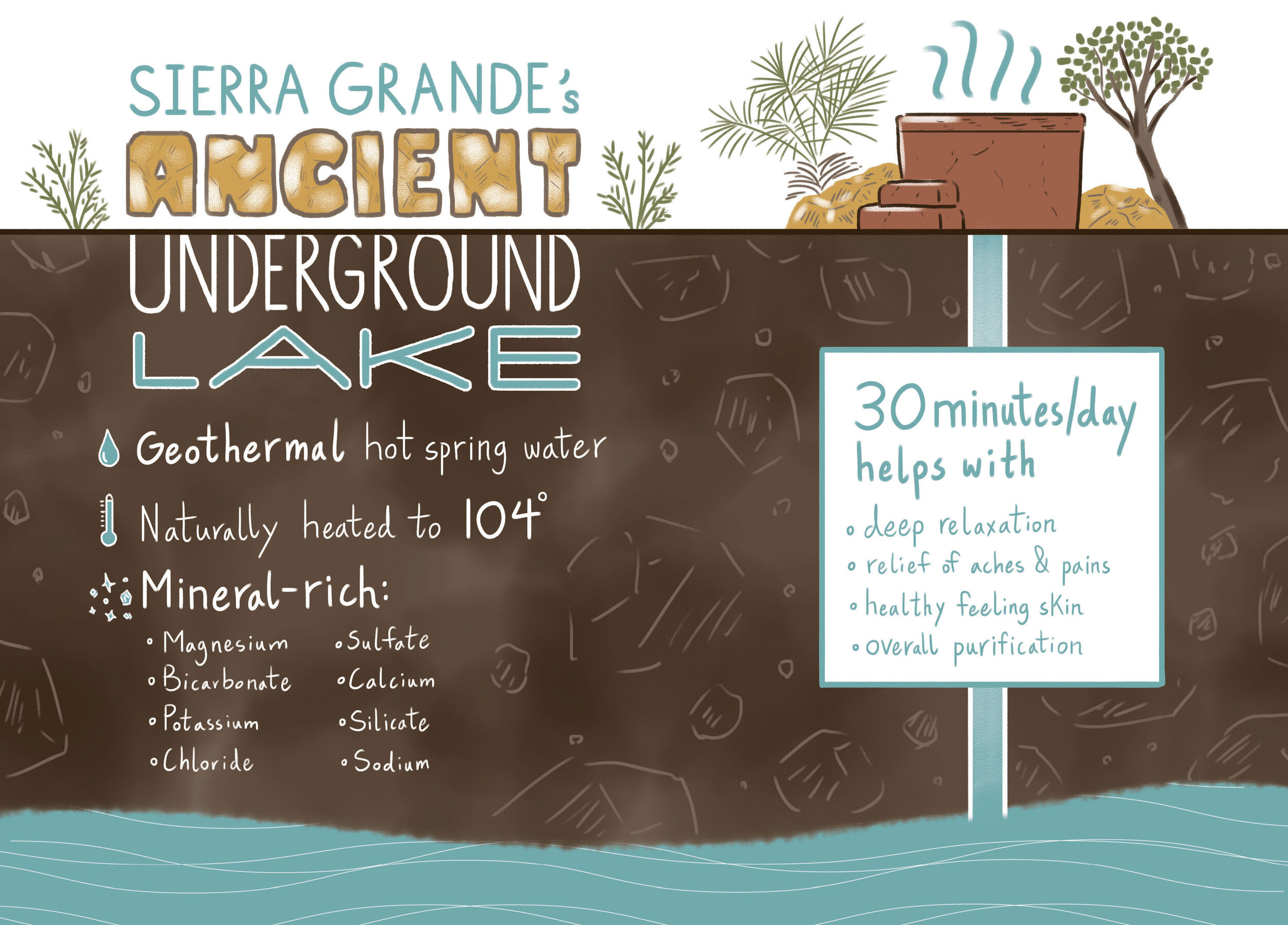
I laid out and illustrated a zine-like “Field Guide”, expanding on the new visual language in my own, playful way, with a focus on the incredible flora, fauna, and historical relics scattered across the reserves. This printed guide was used in mailers to media professionals, as well as on-site as a fun, self-guided way to take in the full breadth of what the properties have to offer.

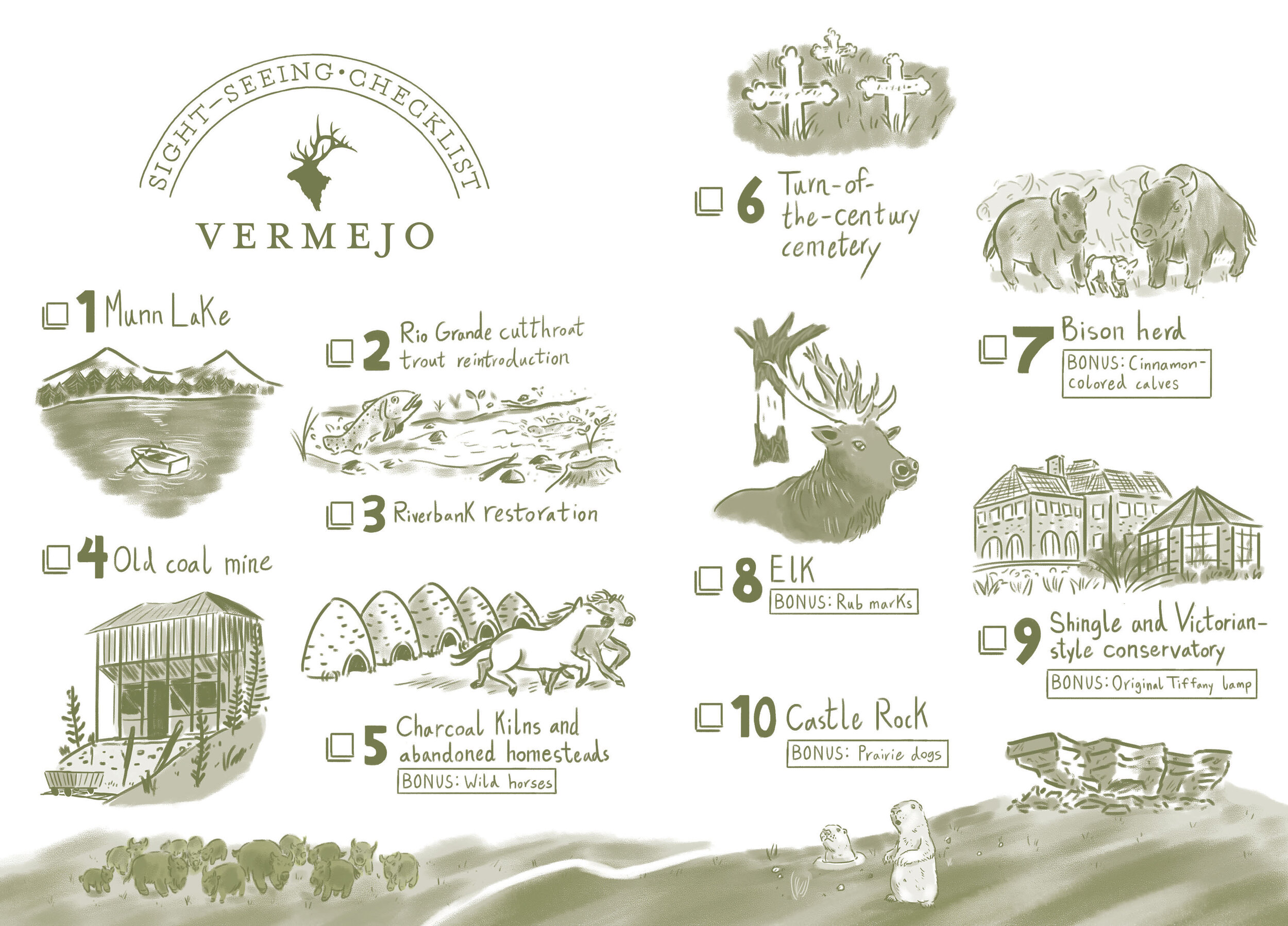
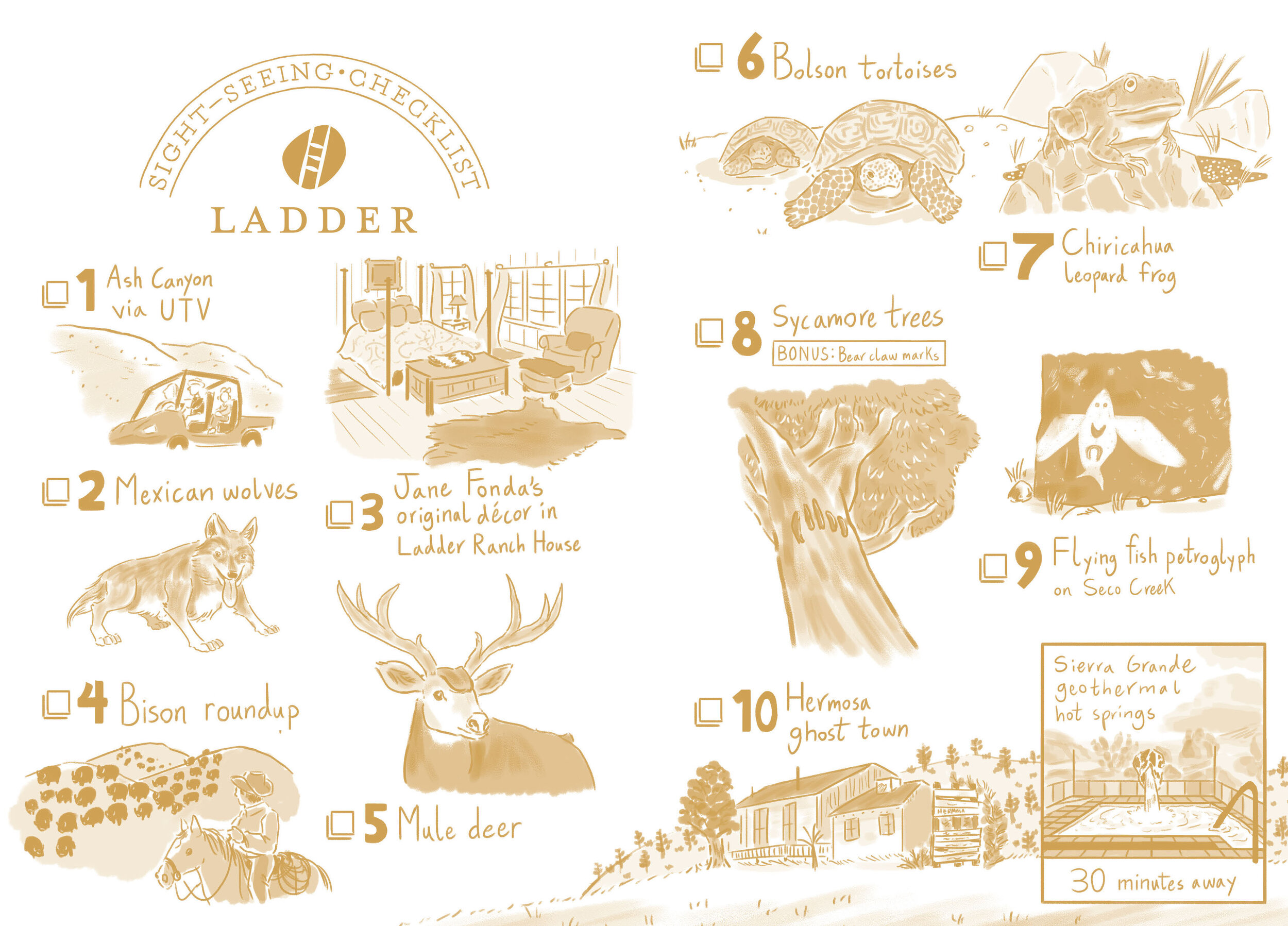
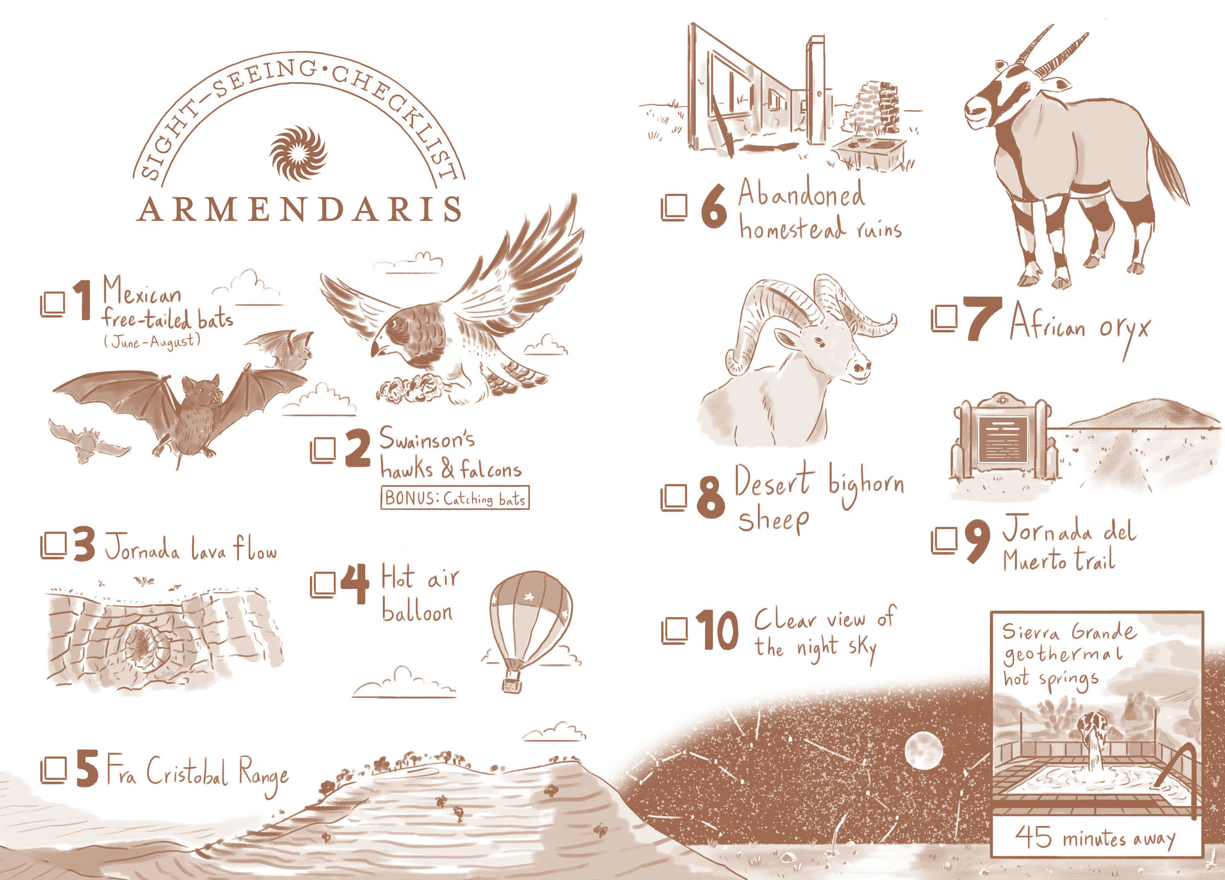

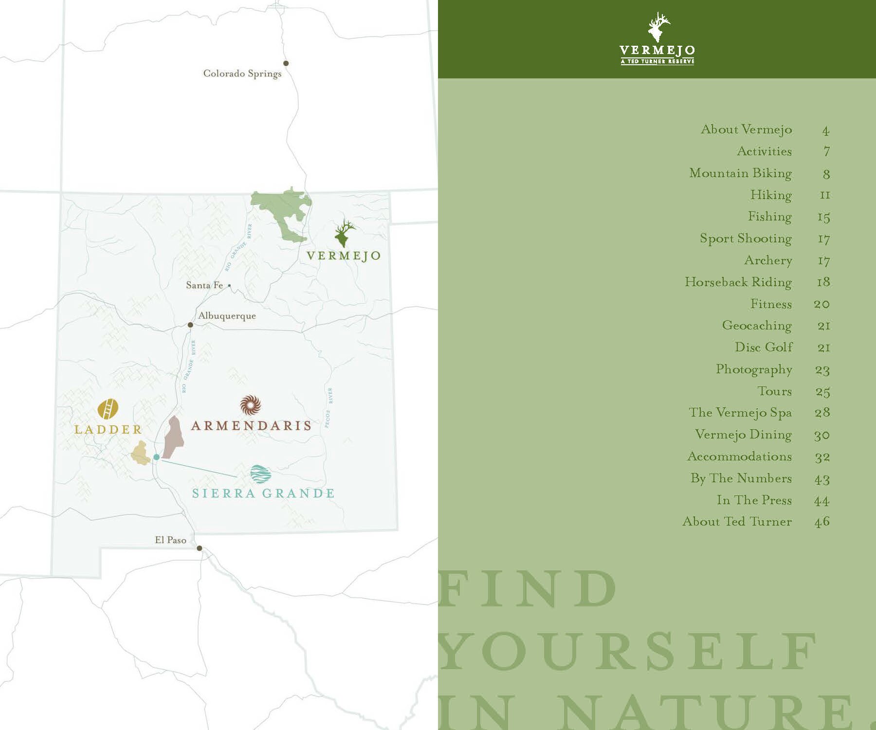
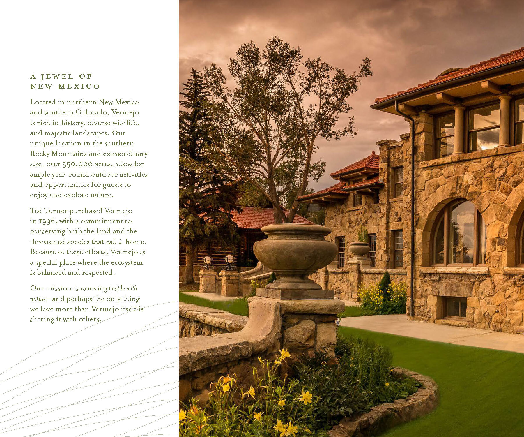
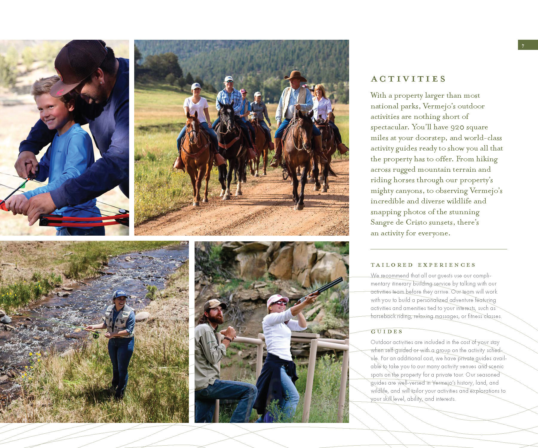
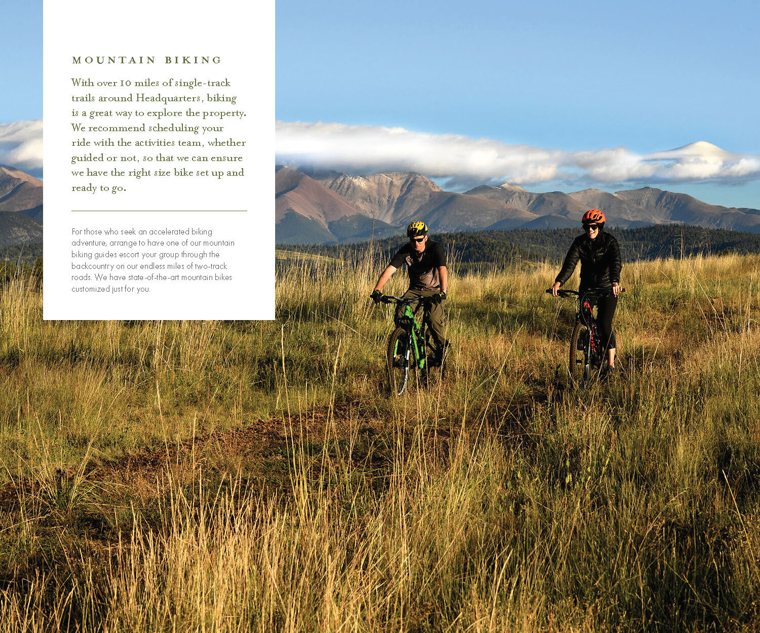
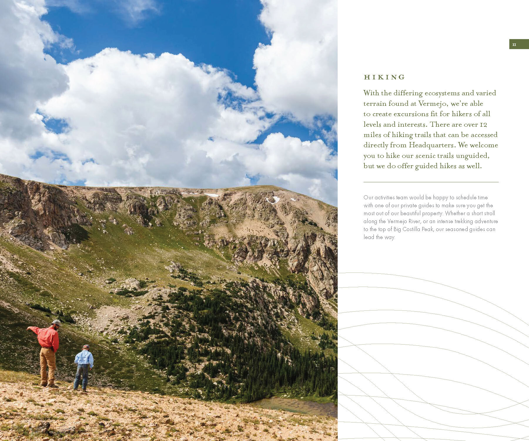
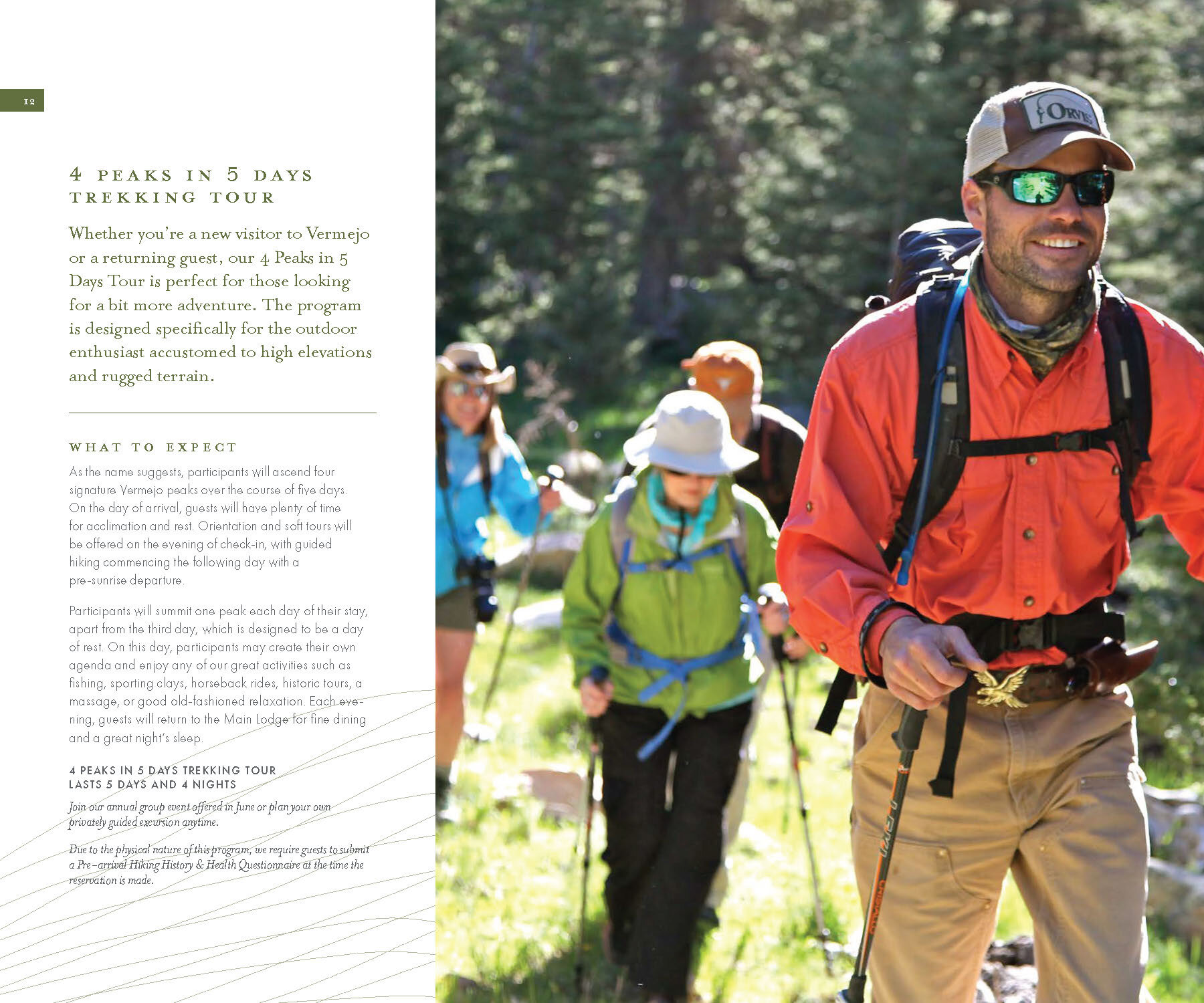
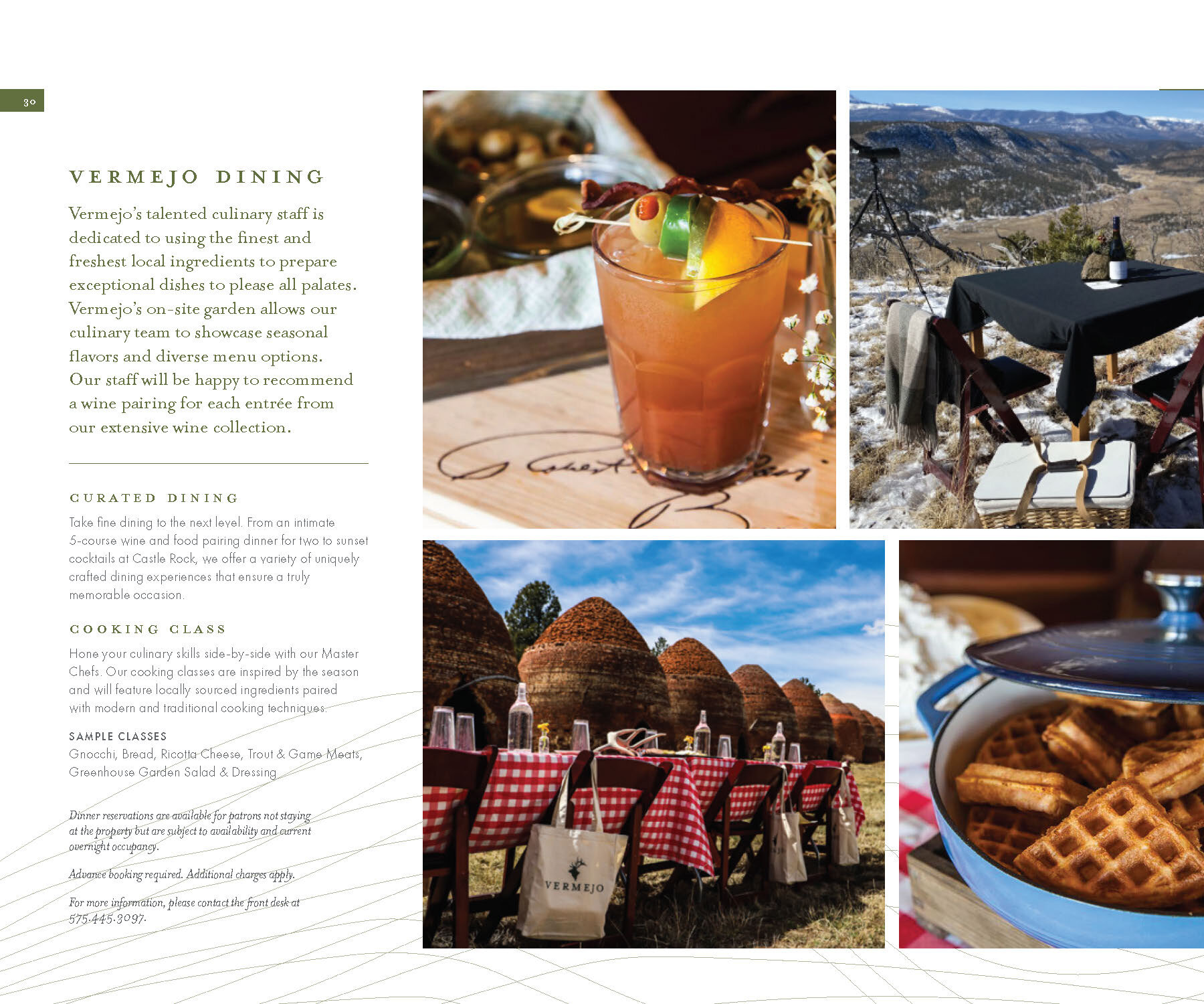
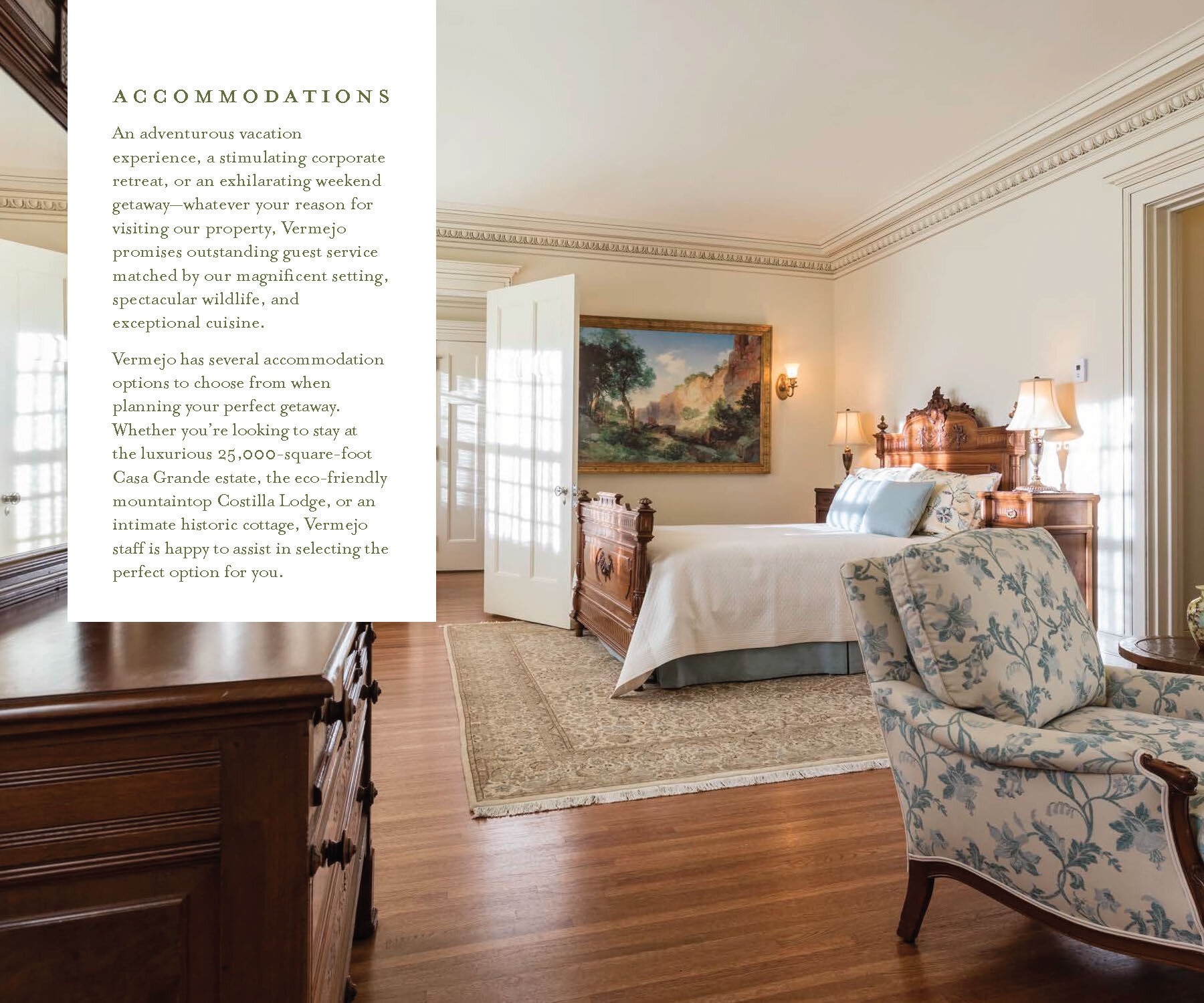
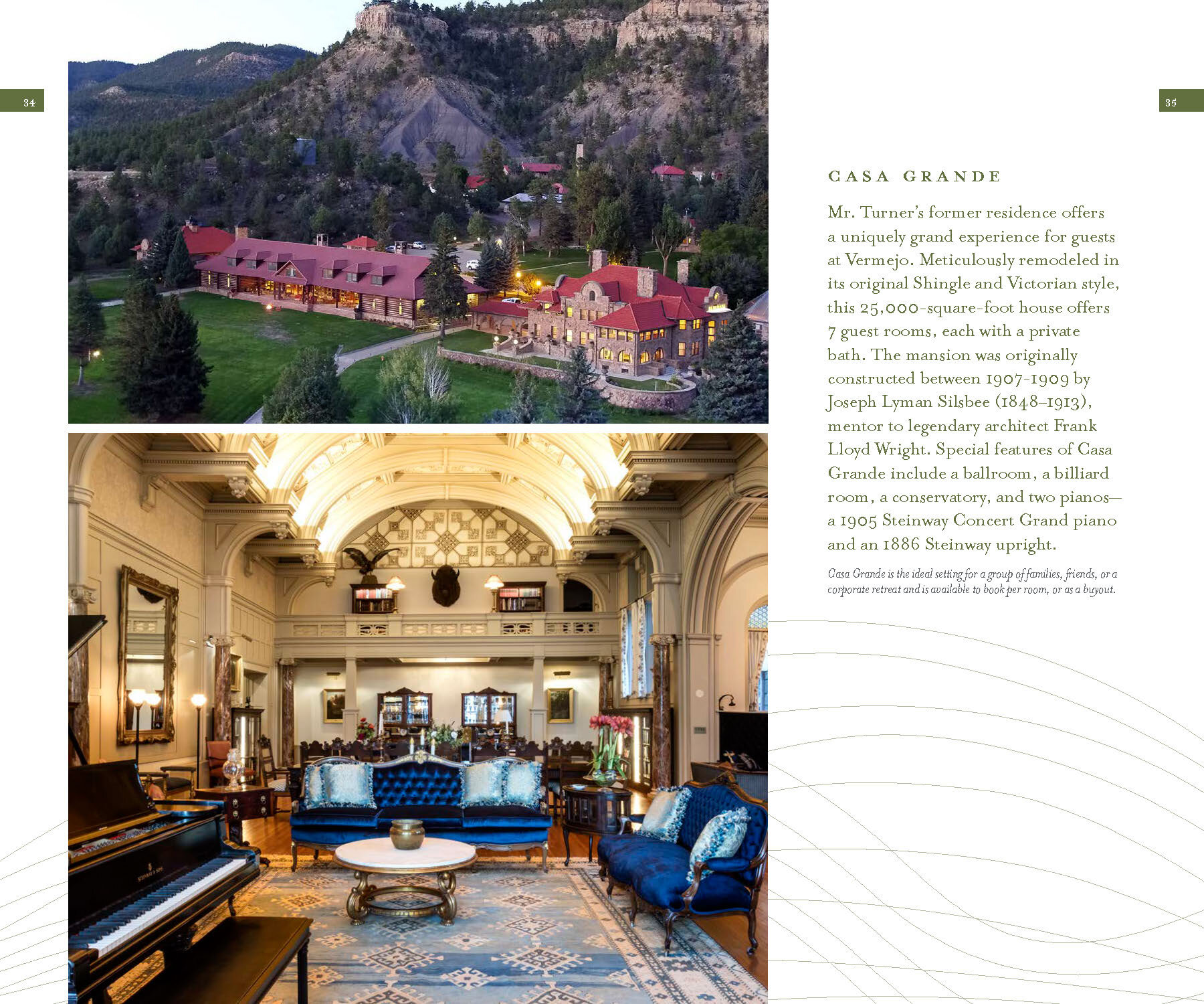
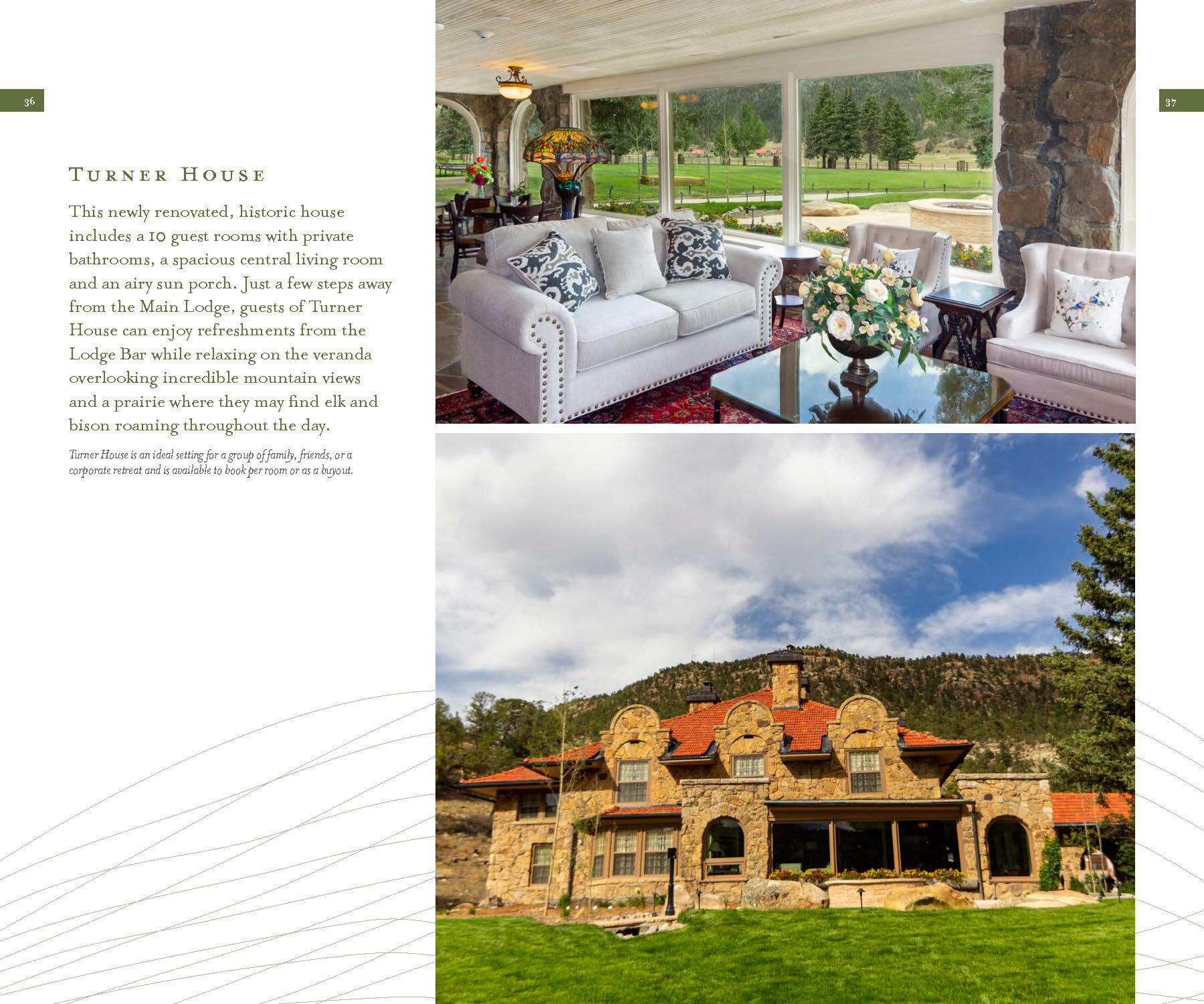
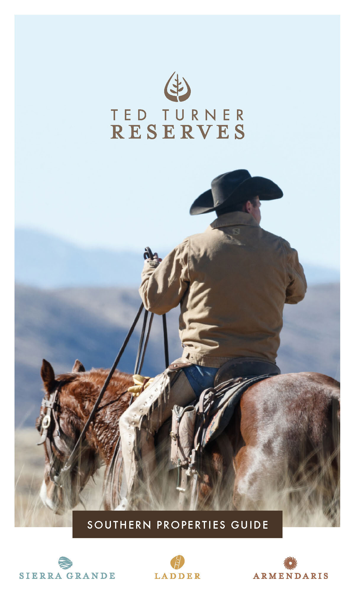
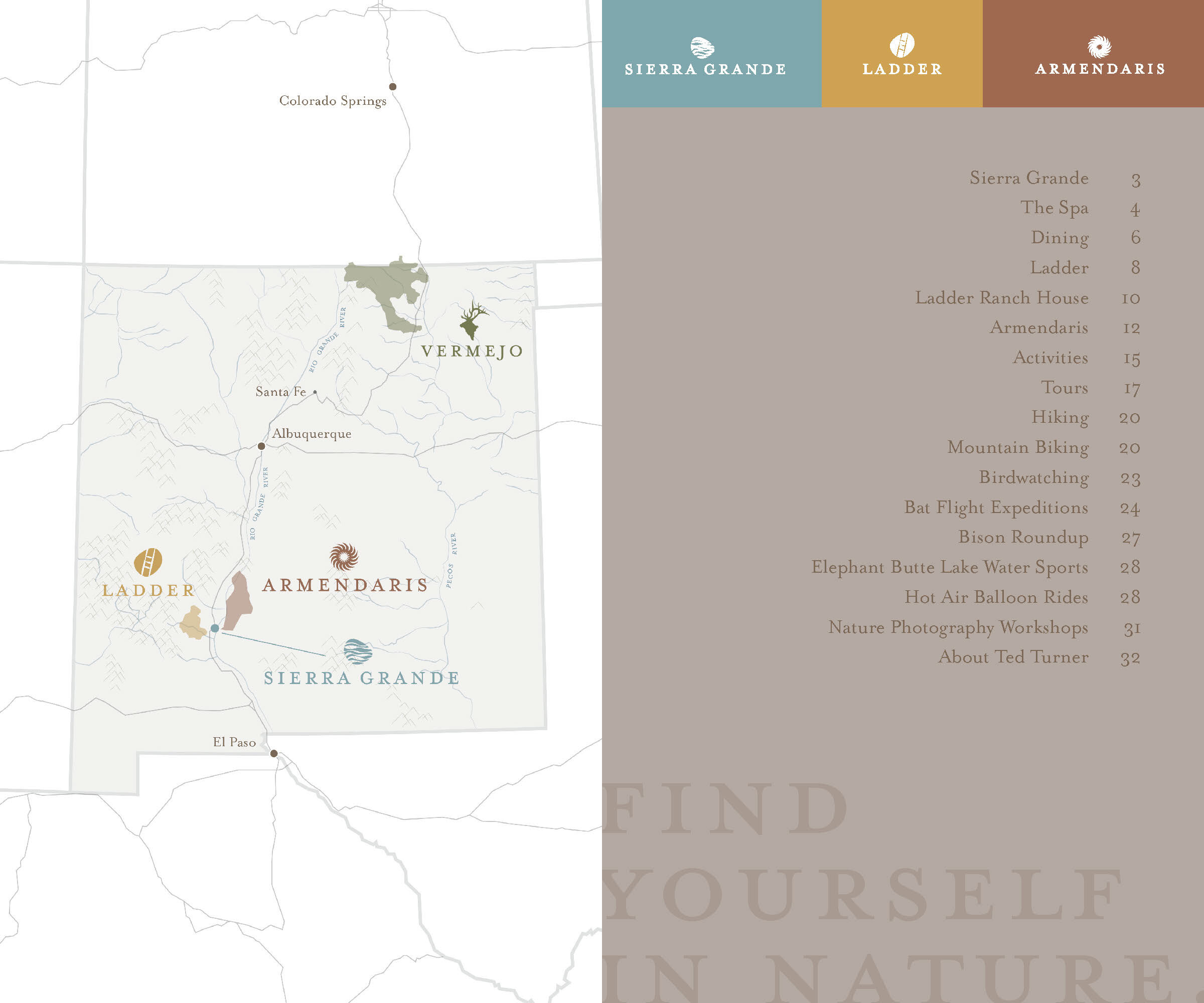
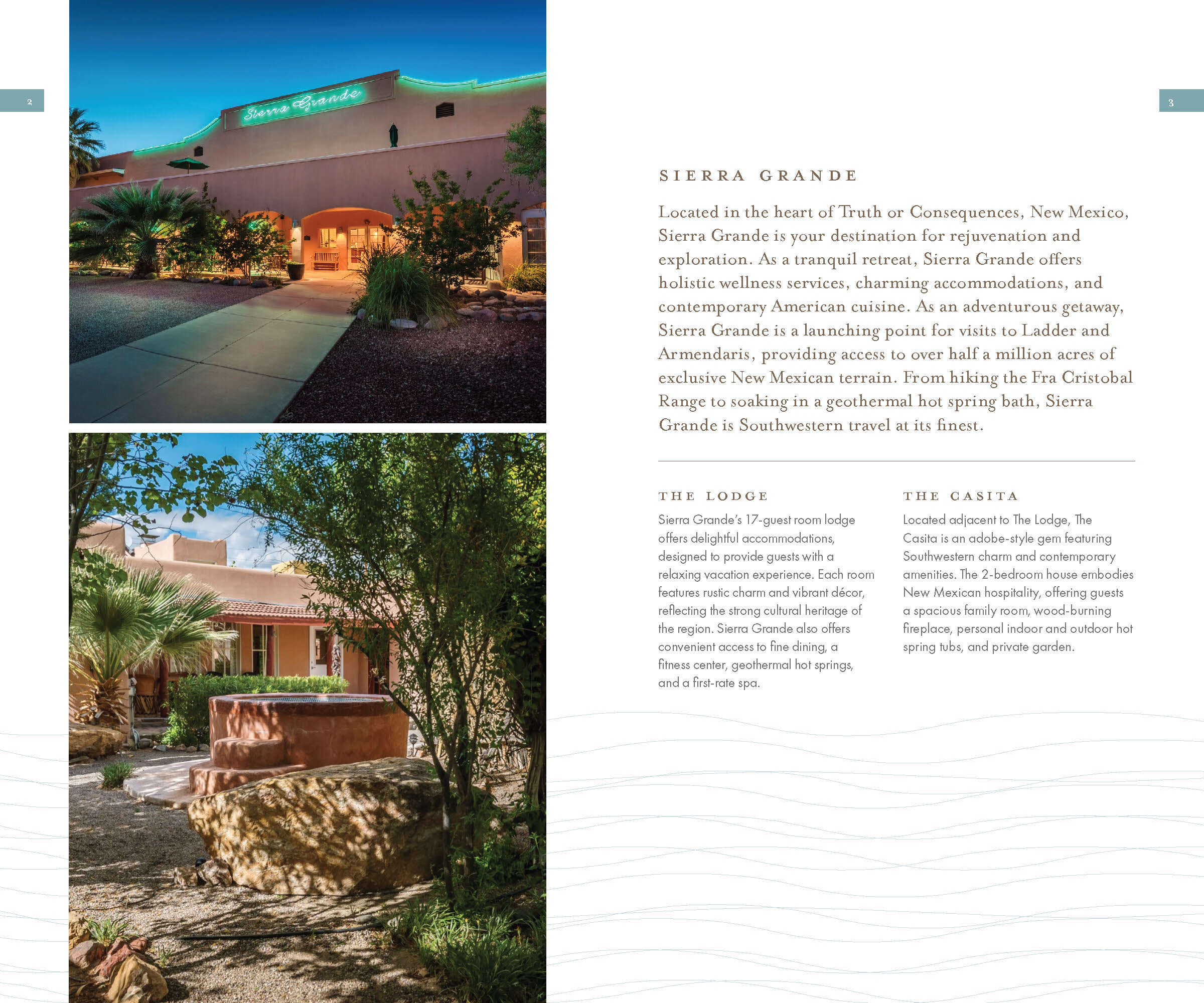
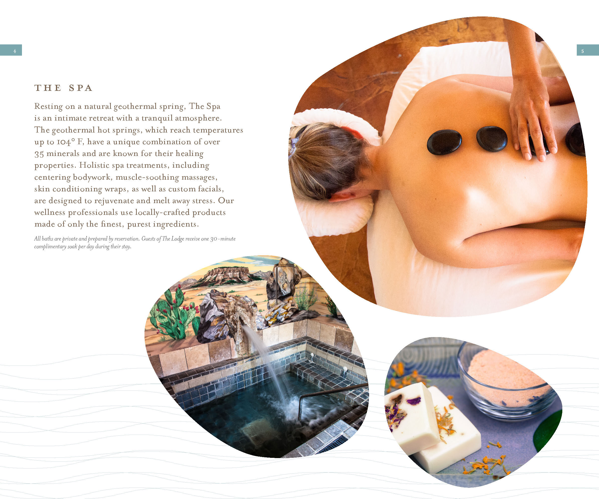
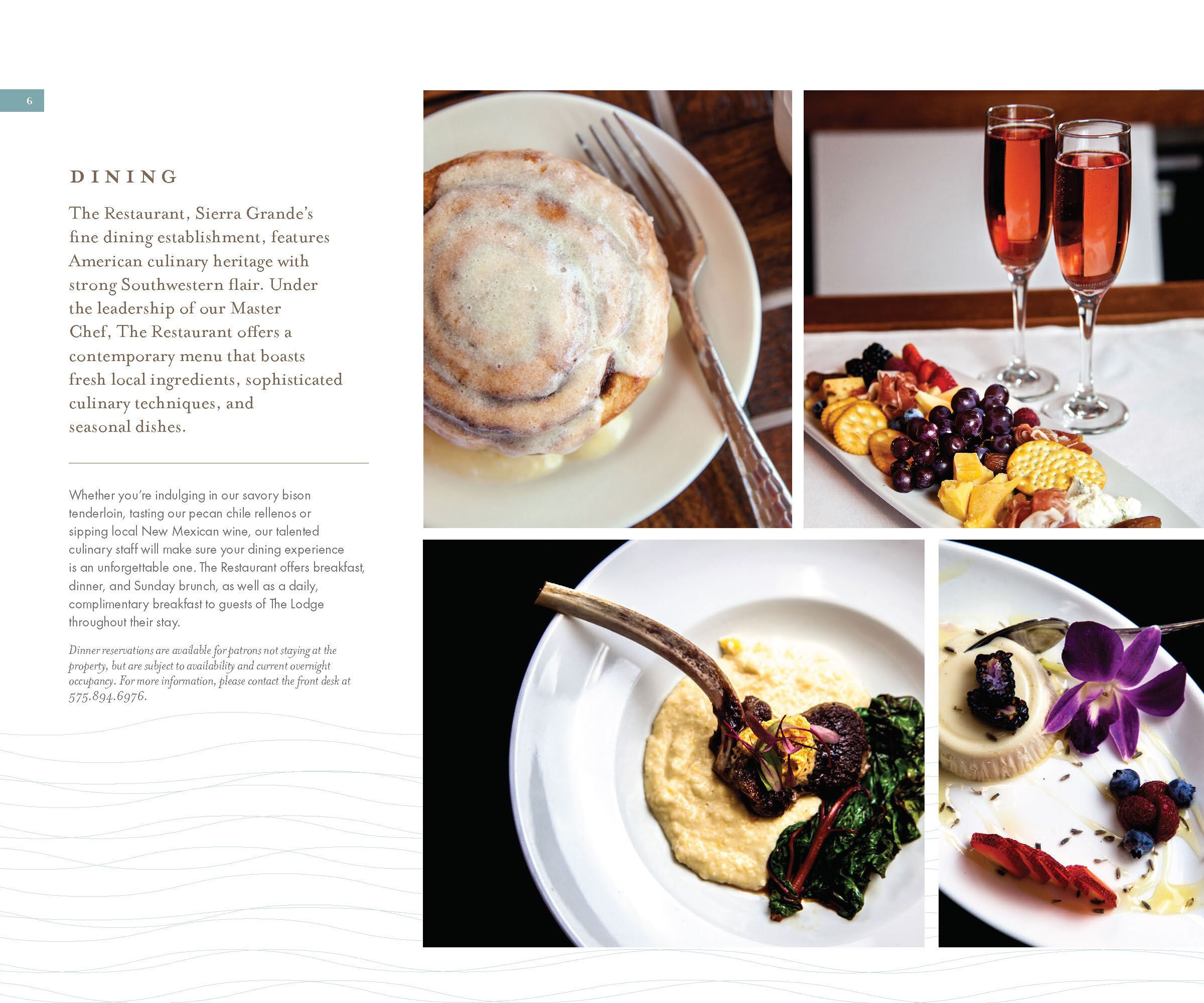
PROPERTY GUIDES
In addition to illustrated collateral, I also expanded on the branding work done by my teammates with two printed field guides, covering the sights, activities, and amenities of the four properties.

COLLATERAL
Along with the long-form Field Guide and Property Guides, I adapted our newly created design system and patterns into a suite of print collateral templates, including letterhead, envelopes, and business cards.


MY TEAM
Brandon Pogrob (That’s Me)
Sr. Graphic Designer, Illustrator
Max Peskin
Sr. Copywriter
Araba Wilson
Creative Strategist
Amanda Brown
Art Director
Bryan Campo
Project Manager
Majel Peters
Creative Director
Naomi Zinner
Vice President, Creative Team